The Dark Pattern Tax: What Deceptive Click Design Is Really Costing Your Business
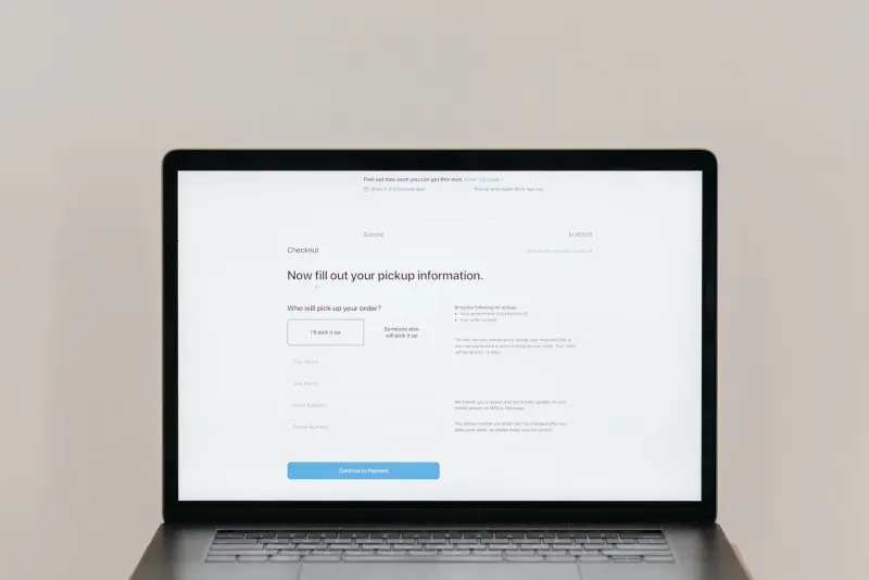
Let's be honest about something the digital marketing world doesn't love to say out loud: dark patterns work. In the short term. If you hide your unsubscribe link in a six-step settings menu, fewer people will unsubscribe this month. If you pre-check the "add protection plan" box at checkout, more people will pay for the protection plan this week. If you make your free trial cancellation require a phone call, your trial-to-paid conversion rate will look great in Q1.
And then the bill arrives.
At PangClick, we spend a lot of time thinking about what makes clicks valuable versus what makes clicks merely countable. Dark patterns are the clearest example of the gap between those two things — and in 2024, that gap is getting expensive in ways that go well beyond customer complaints.
What We're Actually Talking About
For anyone who hasn't spent time in UX research circles, dark patterns are interface design choices that trick or pressure users into taking actions they didn't intend. The FTC has been increasingly vocal about this — they've issued warnings, launched investigations, and started levying real fines. But the legal risk is almost secondary to the business risk.
Common examples in the SaaS and e-commerce world include: hidden fees that appear only at the final checkout step, "misdirection" buttons where the "confirm" and "cancel" options are visually swapped, forced continuity subscriptions buried in free trial terms, roach motel flows where signing up is one click but canceling requires a 20-minute process, and confirmshaming — those cancel buttons that say things like "No thanks, I prefer losing money."
Each of these is designed to manufacture a click that the user wouldn't have made with full information. And each one carries a hidden cost.
The 12-Month Reckoning
Here's the pattern that shows up consistently in retention data: users who feel tricked don't just leave — they leave loudly, and they don't come back.
A mid-sized subscription software company (one that has since overhauled its UX) shared anonymized cohort data showing that customers who had triggered their "confusing cancellation flow" — the one that required navigating three confirmation screens and a retention offer — had a 67% higher churn rate in months 7–12 compared to customers who had never encountered it. They stayed longer initially, which made the dark pattern look like a retention win. But by month eight, those users were gone, and they were significantly less likely to have referred anyone or left a positive review.
The math gets worse when you factor in what researchers call the "betrayal premium" — the disproportionate negative response users have when they feel deliberately misled by a brand they trusted. It's not just that they leave; it's that they actively tell people. In an era where G2, Trustpilot, and Reddit threads drive a meaningful percentage of SaaS purchase decisions, one wave of "I felt scammed" reviews can suppress new signups for months.
Why the Numbers Look Good Anyway
The reason dark patterns persist is genuinely understandable, even if the practice isn't defensible. Most digital businesses measure success on 30 to 90-day windows. A dark pattern that boosts trial-to-paid conversion by 12% in month one is going to look like a product win in every sprint review, every board deck, every investor update — until month seven, when the churn cliff shows up and everyone scrambles to figure out what changed.
By then, the team that implemented the pattern might have moved on. The connection between the design decision and the downstream churn is hard to draw in most analytics setups. And so the pattern persists, and the next team inherits the liability.
This is one of the most insidious things about deceptive click design: it's optimized for exactly the timeframes most organizations actually measure.
Transparency-First Design Isn't Just Ethics — It's Strategy
The counterargument to dark patterns isn't purely moral, though the moral case is pretty solid. The strategic case is actually stronger.
Businesses that have publicly committed to transparency-first design — clear pricing pages, honest cancellation flows, no pre-checked upsells — consistently report higher net promoter scores, higher referral rates, and better long-term retention among the customers they do acquire. They acquire fewer customers via deception, which means they acquire more customers who actually wanted to be there.
Basecamp has talked about this publicly for years. Several consumer subscription companies that overhauled their cancellation flows after FTC pressure reported that their actual churn didn't increase significantly — because most of the customers they'd been trapping into staying were going to churn eventually anyway. They'd just been delaying the inevitable while burning goodwill.
There's also an acquisition efficiency angle here. Word-of-mouth referrals from genuinely satisfied customers convert at dramatically higher rates than cold paid traffic. If your dark patterns are suppressing satisfaction scores, you're also suppressing your cheapest and highest-quality acquisition channel.
The Regulatory Pressure Is Real and Growing
It's worth noting that this isn't just a brand reputation issue anymore. The FTC's 2022 and 2023 enforcement actions specifically named dark patterns as a priority area. California's CCPA regulations include provisions that touch on deceptive interface design. The EU's Digital Services Act goes further. If your business has any ambition to scale — or to avoid legal exposure — the long-term trajectory of regulatory pressure around manipulative UX is clearly toward more enforcement, not less.
Building your click strategy around transparency isn't just the ethical play. In an increasingly scrutinized environment, it's the durable one.
The Honest Click Is the Efficient Click
At the end of the day, every click your platform generates is either building trust or spending it. Dark patterns are essentially a loan against your brand's credibility — they give you a short-term metric boost in exchange for long-term customer relationship debt.
The businesses that are winning on 24-month horizons are the ones treating every click as the beginning of a relationship worth having, not a transaction worth extracting. That's not idealism. That's just good math.